

 Video Game Blog
February 08, 2019
Since I'm focused on the Play Window Map, I decided this was something to address. The Engine has the ability to scale the Play Window at start up. Why not add the feature to allow the User to use it as a zoom ability by clicking on a +/- button? So I'm typing out the story board as to how that would work. There's some aspects of the current system that have to be altered slightly to accomodate this feature.
Of course this feature would not be available to all of the games that could be built off of this Engine. And there is also the consideration that Users using small-screened monitors trying to zoom in wouldn't be able to see much more than a few Tiles in the Play Window.
As I am evaluating the changes needed to accomodate this idea...I'm come across a slight problem with the original that does not meet the design requirements. I'm going to put the zoom feature on hold and deal with the bug.
 I like to muse while I'm trying to figure out how to do something. So, I will
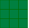
talk some about how Tiles are projected to the screen. Let's start with the
simplist one...Square Tiles. Here you see a simple 3 x 3 pattern of Tiles laid
out from left to right, top to bottom. These are easy to figure out how to place
because they are simply (X-Coordinate * TileWidth), by (Y-Coordinate * TileWidth),
and iterated through for the height and width of the Play View.
I like to muse while I'm trying to figure out how to do something. So, I will
talk some about how Tiles are projected to the screen. Let's start with the
simplist one...Square Tiles. Here you see a simple 3 x 3 pattern of Tiles laid
out from left to right, top to bottom. These are easy to figure out how to place
because they are simply (X-Coordinate * TileWidth), by (Y-Coordinate * TileWidth),
and iterated through for the height and width of the Play View.
When the dimensions of the Play View are considered, Square Tiles are also the
easiest to work with. It would be great to use Square Tiles for every game...but,
they aren't the most appealing for a variety of games. In fact, it's a rare game
now that looks good using this pattern. The best view for this is "Top Down".
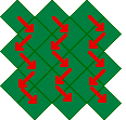 The next style that most closely resembles the Square Tile pattern is the
Square-Isometric pattern. Seen here, they appear to be 'square', but rotated up
on their points. I saw 'square' because the width and height of this image is not
32x32 like the squares above. These are 32x31. The reason for this is when they
get projected, they overlap each other a little too much to look professional.
I avoid this problem by reducing the height by one pixel, but still calculate
the drawing at 32x32. It ends up looking good without do all too different math.
This view is only slightly more complicated when projecting onto the screen. What
is important is that if you look at the arrows, the flow of which Tile is 'above'
the other is off set down and right. The array of data that these Tiles are
determined by are still in a 'square' pattern. But to give this the grpahics
engine just projects them into this pattern. Also, when the Player navigates
through the game world, you have to do some weird math to know which Tile they
are stepping onto when they move. For instance, if you want to move to the Tile
that is 'down and left' of your current position, you would simply add +1 to the
Y-Coordinate. If you wanted to go to the Tile directly south of your current Tile,
it would be +2 to Y-Coordinate. Going straight to the right would be X-Coordinate
+1. It's a bit of a hassle yes...but, once you set up a pattern it can be left
to the software to handle it.
The next style that most closely resembles the Square Tile pattern is the
Square-Isometric pattern. Seen here, they appear to be 'square', but rotated up
on their points. I saw 'square' because the width and height of this image is not
32x32 like the squares above. These are 32x31. The reason for this is when they
get projected, they overlap each other a little too much to look professional.
I avoid this problem by reducing the height by one pixel, but still calculate
the drawing at 32x32. It ends up looking good without do all too different math.
This view is only slightly more complicated when projecting onto the screen. What
is important is that if you look at the arrows, the flow of which Tile is 'above'
the other is off set down and right. The array of data that these Tiles are
determined by are still in a 'square' pattern. But to give this the grpahics
engine just projects them into this pattern. Also, when the Player navigates
through the game world, you have to do some weird math to know which Tile they
are stepping onto when they move. For instance, if you want to move to the Tile
that is 'down and left' of your current position, you would simply add +1 to the
Y-Coordinate. If you wanted to go to the Tile directly south of your current Tile,
it would be +2 to Y-Coordinate. Going straight to the right would be X-Coordinate
+1. It's a bit of a hassle yes...but, once you set up a pattern it can be left
to the software to handle it.
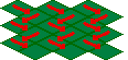 Speaking of patterns...here' the next map style, Rhombus-Isometric. Here you see
the arrows pointing in the direction of projection. This Tile version has the
same problem of overlapping like the Square-Iso does. So, the width and hieight
don't match evenly, but still projected with the same math (at 1/2 the height).
You can see by the arrows that the projection follows the same rules. Avatar
movement also follows the same pattern. So, these two map styles share almost the
exact same code for everything...just with the modification of height.
Speaking of patterns...here' the next map style, Rhombus-Isometric. Here you see
the arrows pointing in the direction of projection. This Tile version has the
same problem of overlapping like the Square-Iso does. So, the width and hieight
don't match evenly, but still projected with the same math (at 1/2 the height).
You can see by the arrows that the projection follows the same rules. Avatar
movement also follows the same pattern. So, these two map styles share almost the
exact same code for everything...just with the modification of height.
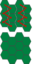 The final map version, the Hexagon-Isometric map is a bit more complicated.
From the books I talked about in the previous month, they did a version where the
Hexagons were standing on their points. I could have used their version, but I
as I mentioned I wanted to have Hexagons that were on their flat sides. Another
problem was that to make the Tiles look as close to a Hexagon as possible, the
had to be drawn with an irregular pattern. Because of this, the tiles have a tiny
ibt of overlay - like four pixel overlap on each facing of the Hexagon.
The final map version, the Hexagon-Isometric map is a bit more complicated.
From the books I talked about in the previous month, they did a version where the
Hexagons were standing on their points. I could have used their version, but I
as I mentioned I wanted to have Hexagons that were on their flat sides. Another
problem was that to make the Tiles look as close to a Hexagon as possible, the
had to be drawn with an irregular pattern. Because of this, the tiles have a tiny
ibt of overlay - like four pixel overlap on each facing of the Hexagon.
In these two graphics, you can see how I have a separated view along with the
condensed version. You can see how close the images are before setting them
closer...The loss of image has to be considered when drawing any images that
might need as much of the hexagon as possible to look good.
Again you see the stepping pattern of the tiles. I had to drop the book's version
of calculations to figure out where the mouse in pointing at for the Cursor. But,
I was able to make it follow the same pattern as for the other versions...which,
the strongest aspect about creating software is to make code that is adaptable
to a variety of situations.
